Showing posts with label colour. Show all posts

Sunday, August 30, 2020

Watercolour Leaf Printing

I knew there was a reason I'm a facebook user..... I ignore all of the depressing news stuff and follow some very interesting art related groups.  These groups bring together like-minded people who post all sorts of photos and information about what they doing in their art studios.  Sometimes I find some particularly tempting techniques, such as leaf printing using watercolours.

I give my acknowledgements and thanks to Karen Rush who posted in Craft Press Printmakers facebook group, where she introduced this technique that she learned from Rebecca Chamlee of Pie in the Sky Press.  

Its a straightforward process.  You paint dry leaves with watercolours, let dry, then print onto damp watercolour paper.  Its wonderful that something so simple can produce lovely results, without all the mess and fuss of the usual monoprinting processes.

I've shared this technique a couple of times with friends, and we've had a great time sitting around a table (social distanced of course!) painting, printing, chatting..... and then laughing over the ones that don't quite work.  

I'm grateful that at the moment we can gather together with friends to make art, but if you can't, please try it yourself.  Its a great dining table activity with children or if you have a spare hour or two.

To print the leaves, I used my Xcut diecut machine, but you could use any craft press or manual pasta maker.  You could try hand printing, but you may not get the detail of the veins or it might move around a bit.  Of course you can always 'tweak' the less successful ones with a fine marker pen and more watercolour when it drys.  Nothing is ever wasted!

Two colours on a grevillia leaf.
Leaves with interesting silhouettes and veins are best.

Two or more colours works best.
I put a layer of pink, let it dry a bit, then
added the paynes grey.

Yes this is a print, not the actual leaf!
I've found that the colour improves
after a few prints and re-inkings.
This one started with orange, then a mix of yellow ochre,
sepia then other colours I can't remember....
That's the magic of monoprinting,
it keeps it secrets well!

Beautiful colours and a bit of embossing too.

Applying watercolour, but
keeping water to a minimum because you
need the pigment to be strong.
Let dry before printing.

Another beautiful leaf! 
I think its the one I'm painting in the photo above.
These will make beautiful cards - I use double
sided tape to mount the print onto coloured card.


Saturday, June 29, 2019

Exploring Woven Concertina Books

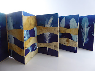
At a recent meeting of Papermakers & Artists Qld, we learnt an interesting technique of woven concertina books.  I've also completed Helen Hiebert's online weaving course this year, so I've had an interest in the idea of using my old folio monoprints to create new images in a woven form.

For the upcoming Compassion exhibition (details below), I decided to make a small series of woven concertina books, using old monoprints, collagraphs and rusted papers.

The technique I used was to fold a long concertina and cut long strips through the middle (reserving the ends for covers).  Then weave pieces of another print for each of the concertina pages.  The result gives maximum contrast and interest to a couple of ordinary prints.  Most of the prints were double sided, but with those that weren't I added more strips of left over prints, some of them not even the same size.  I applied some glue so that the book didn't work itself loose and they look better without too many gaps.

I'm happy with the completed books....and my folio and print drawers are a little bit less full now :-)

These books will be on sale at the Compassion exhibition at the gallery shop.

Step 1 -fold concertina then cut strips along middle

Step 2 - weave strips of contrasting prints.
The width of each strip is equal to the
width of the concertina pages/

Finished woven books, showing prints
glued to create covers.

The weave.  This one is interesting - it looks like the
Magpie is walking past a Venetian blind :-)

The one weaves a feather monoprint with a brown collagraph.

Collagraph print as a cover, I love the scratchy texture
of this one.

This one has rusted paper with feather monoprints.

This is where they will be on sale.

Sunday, May 26, 2019

Listening to Rain

I've just finished reading a wonderful book, titled 'The Song of Trees' by David George Haskell.  Each chapter is about an individual tree somewhere in the world.  Haskell weaves poetic stories about the links those trees share with their surrounding environment and how that influences the humans and other animals that interact with them.  This narrative of 'connectivity' of all things natural really resonates with my art practice, so I found the book a great source of ideas and inspiration.

One such idea that Haskell presents in his book is the physicality of sound, particularly the sound of rain and how it reveals the shape and structure of trees.

Here is a short quote from the book:

"The water that strikes the understory has already passed across many leaves above...rhythms of the understory are born in the diversity of leaf shapes.  We hear rain not through silent falling water but in the many translations delivered by objects that the rain encounters."

A few weeks ago, I posted on my blog about Remembering Trees Lost where I had printed a series of monoprints inspired by the removal of trees for road widening near where I live.

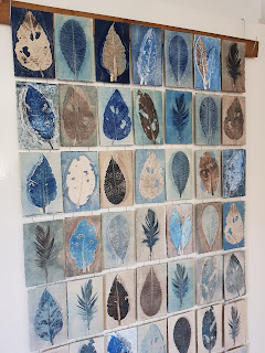
Some of those monoprints have been assembled and framed for a small series of works titled 'Memory of Trees', but I held back 56 of the card-sized prints to create a hanging book, inspired by Haskell's idea of the sound of rain and my recent experiences at the BioBlitz sitting in the rain beneath the rainforest canopy.

The prints hang on linen thread from pieces of repurposed wood.  The prints are graded from dark to light to reflect the intensity of the sound of the rainfall as if the leaves are speaking the rain's language.

The book is titled 'Listening to Rain', and will be exhibited next month at 'Compassion' an exhibition of artist books on the Sunshine Coast.


Monday, January 15, 2018

Monoprinting over the Christmas Holidays - Part 1

I've been busy printing over the Christmas break, exploring a few different monoprint directions.

Firstly, for an upcoming hospital exhibition, I needed to print very large - my plate was 68cm x 46cm - the largest monoprints I ever done.  The large size provided a few interesting compositional challenges, and I also had to make use of my large studio etching press (which is always a pleasure to work with!).

I also wanted to try a new style of just one major colour, highlighted with a black image.  That's quite a challenge for me, given I tend towards 4+ colours and tons of mark making.  Holding back and keeping it minimal isn't easy!

Because I was working big, I did some smaller test prints just to see how my theory would work.  It turned out to be a great idea and gave me plenty of confidence when I had to tackle the bigger prints.

Three of the six successful prints will be exhibited for six months in a local private hospital, alongside some scrub turkey and leaf prints.  I have titled this Magpie series 'The Sentinel' referencing the territorial behaviour of magpies. 


This was my paper soaking 'tray' - a garbage bag as I didn't have a tray or
tub large enough!  Not perfect but worked OK.

In progress - leaves and Magpie stencil

Of course I printed with my favourite colour - Aqua....!
I just love it on these gorgeous gum leaves.

One of the finish prnts.  I couldn't help myself and snuck a
bit of green in there to add a bit of 'pop'!

This print is just aqua with the black caroling Magpie.
Simple and as minimalist as I can get!

I'll blog next week about the second series of monoprints that I did over the holidays.

Saturday, October 21, 2017

The Scrub Turkeys return

Its been a few years since I printed a Scrub Turkey series.  Its one of my favourite birds (after wrens!).  I recently sold the remaining Turkey prints from my last series, so I thought...why not?  Lets print some more!  Each series is different, and shows the advances in my technique and colour choices.

I've named this series of 13 prints "Bird vs Backyard" highlighting how the Scrub Turkeys' cross the boundaries between urban and natural areas.  Locals have a 'love/hate' relationship with them and keen gardeners are frustrated by the turkeys' instincts to collect mulch to create their nest mounds.  Its quite a backyard battle!

And a first for me, I took a short video as a printed - its at the bottom of this post.  I must admit it was a low-tech video using my phone and a selfie stick but I hope you enjoy it!
 
I always like to plan my compositions before I start printing -
laying out my stencils and objects to see how they work together.

I was gifted some awesome mesh which I used in my wren
prints last week.  Here are the marks left by the mesh on the plate
from a previous print, ready to print off onto the next print.

A happy accident - I was inking up a stencil on scrap paper
and it ''printed itself'....nice!  I'll find a use for it - right now it reminds me
of the magic of monoprinting and the serendipity of the process.

One that didn't quite work.  I changed my colours after this one.
I'll still use it for something, maybe cut it up.


The best print in the series (in my opinion).  Blue and brown are my
favourite colours, so I keep coming back to them.

I reverted back to my old technique a few times, overprinting
on ghost prints which provided more interesting marks and textures.

White space is always a good compositional tool,
but its tricky to get the balance right like I did here.


Saturday, October 14, 2017

Monoprinting as Therapy

There's nothing like immersing yourself in a week of printing, even if interrupted by daily distractions....

After spending a week at Geelong teaching monoprinting, I was determined to not pack away my inks but set up my print studio and have some fun with my little Xcut Xpress machine.

I dug out my favourite wren stencils and got to work....


Inked plate and objects ready to print on the
bed of my Xcut machine.

Revealing the print after printing.
I used tinted Stonehenge, dampened and torn to size to
print as bleed prints.

My ink stations - printing on my own means
I need to chose my colours carefully as I only put
out three colours.  Less to clean up at the end of the day.

A feather print in progress, just for something different!

One of the successful prints, but not every print works.
I used my favourite Kangaroo Grass in this series,
I love its feathering appearance.

Another of my favourite wrens.  The pattern at the
bottom was from some mesh that was
gifted to me - a real treasure!

I had to trace around the outline of this wren
after the print was dry to make him
stand out a bit more.

Monday, September 5, 2016

Replicating a Monoprint

Back in January, I blogged about a series of monoprints for an exhibition "Women of Substance", see my post here.  The seven monoprints that I created for the exhibition and folio boxes are all sold or accounted for, the remaining print was a gift to my mother, who was the subject of the print.

I was recently asked whether I had any more of these prints, perhaps an artists proof. Sadly with monoprints, there are no artists proofs (or test prints or the first prints in an edition). Every print is a unique print, some work and some don't.  And the variable 'edition' is as many prints as I wish to make in that series.

Hence, to fulfil the commission, for the first time I needed to replicate my monoprint.

Luckily I found where I had stored my stencils, and because I blogged about the print, I had great documentation about my colours and what objects I used.

But the process was still a challenge, and the monoprints that I've produced in this second run are different from the first run.  There are subtle differences in how I mixed the colours and how I applied the ink and the objects.

The mysterious and free process of monoprinting has many rewards and I never know what the outcome will be even when I'm repeating a print process like this.  Below are 3 of the 10 prints in this new series.  There are another six that I rejected...maybe they will be the content for an artist book someday....nothing is ever wasted!


Sunday, July 24, 2016

Screen Monoprinting

One of the first monoprinting techniques I explored before I got my etching press Thumper was using a silk-screen.  The process involved painting a design on the screen using acrylic paints, then squeeging onto paper using Print Paste.  I then worked back into the dried print using oil crayons to add detail and highlights.  Below are a couple of my prints, probably produced around 2006.


I love their colour and movement.  Using the silk screen to monoprint is very expressive process where the initial image is created without first drawing or tracing.

Today I used some mini-silk screens to try water soluble crayons using this screen monoprinting process.  I drew on the screen using the crayons, then experimented with Print Paste as well as Gloss Gel Medium.  The results were interesting, and it's a very quick spontaneous process - just what I love about monoprinting.  Its definitely a technique that I would be able to take travelling with me.

The screens, squeege and mediums I used

Test print

One of the ghost prints, showing some colour stuck in
the screen

Another test print